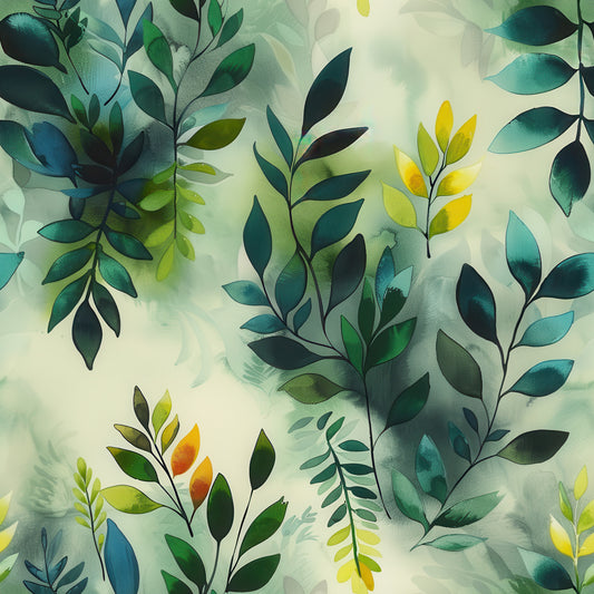
Between light and shadow, leaves mark the crossing point. This is where one color field ends and another begins.
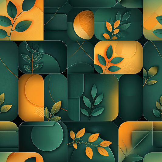
"Threshold" is characterized by its vertical division between luminous orange-gold washes and deep forest green panels, with botanical elements positioned strategically at the transition points. Leaf clusters appear where warm meets cool—upper corners, center intersections, lower edges—as if marking the boundary between two distinct atmospheric zones. The left orange section features painterly washes ranging from pure tangerine to soft golden yellow with visible drips and texture that suggest watercolor spontaneity. The right deep green section provides moody depth in shades from emerald to near-black teal. Botanical elements vary in style and color: sage-green leaf clusters at the top left, autumn-toned maple leaves at the center divide, a vertical stem of orange-to-yellow gradient leaves on the green side, and a pale skeletal leaf at the bottom. Each botanical marking reads as intentional placement rather than random scatter.
The vibe: Compositional transition. Nature marking boundaries between light and dark. The design equivalent of standing in a doorway at dusk.
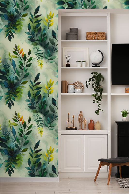
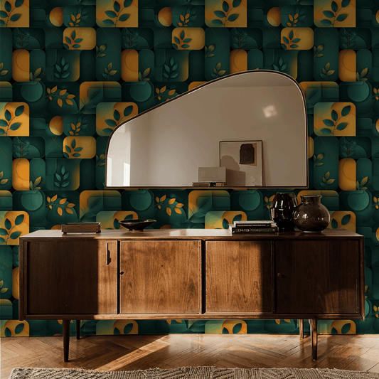
Works beautifully in: Entryways where the name becomes literal, powder rooms that value negative space over coverage, dining room accent walls that want drama without density, or bedrooms where you want botanical presence at the edges rather than overwhelming the center. This is for people who understand that where you place elements matters as much as the elements themselves.
Real talk: Threshold shares DNA with Divide—both use vertical panel structure with corner/edge botanical placement rather than all-over pattern. The key difference is Threshold's painterly, atmospheric quality in the orange sections versus Divide's cleaner color blocking. The visible drips and washes give this more organic, less controlled energy. The large expanses of solid color (orange and green) mean this pattern provides generous breathing room—you're not drowning in botanicals. The orange sections will show wall imperfections more than dark patterns, so wall prep matters. The botanical elements are positioned to emphasize the vertical threshold/division, creating a sense of crossing from one space to another. This works best on walls with adequate width (6+ feet) where the panel structure can establish itself properly. If you want dense botanical coverage, look elsewhere. If you want botanicals that mark space rather than fill it, that suggest transition and boundary, Threshold does exactly that.
For spatial designers, transition lovers, and anyone who believes the most interesting moments happen at edges.
Collection note: Part of the Eventide series, where we capture twilight's refusal to choose between warmth and shadow.
First wall? Our measuring guide takes ten minutes, and the peel-and-stick and paste-the-wall install guides walk you through hanging day.