Vertical color fields meet botanical precision. Orange burns bright against green shadows, florals anchoring the transitions.
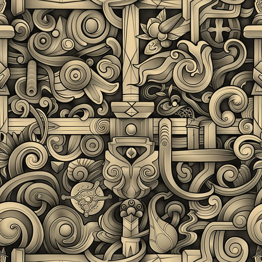
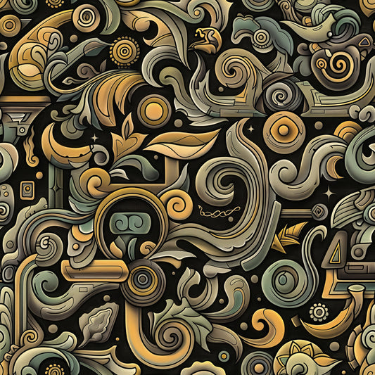
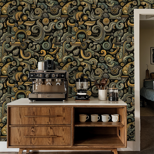
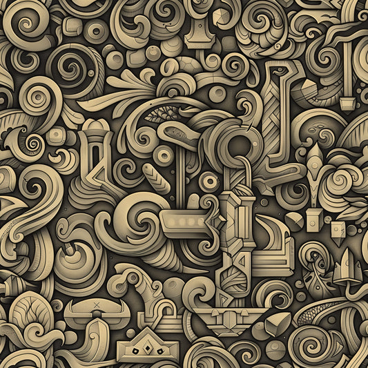
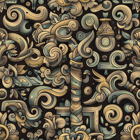
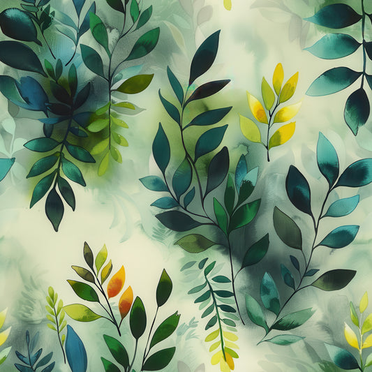
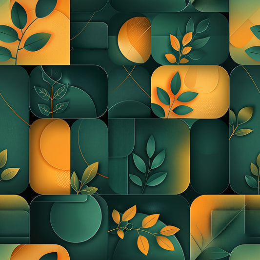
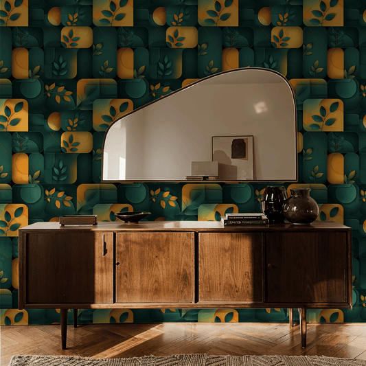
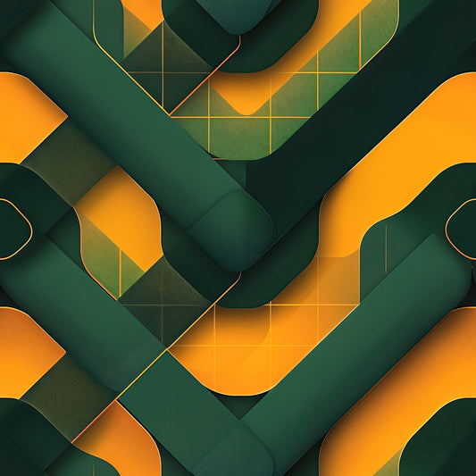
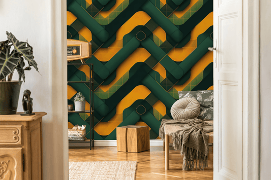
"Panel Burn" is characterized by its bold vertical stripe system where wide bands of saturated orange and golden yellow alternate with deep forest green sections. Unlike subtle color blocking, these are substantial vertical divisions—each stripe wide enough to establish its own presence. The orange panels range from pure tangerine to soft golden yellow with visible painterly texture and gradient transitions that create atmospheric depth. Within each color field, golden and orange poppies position themselves strategically—some fully rendered with dimensional petals, others appearing as silhouettes or tonal impressions against their backgrounds. Dark green foliage provides anchoring weight, with leaves ranging from sage to near-black teal creating layered botanical depth within each panel.
The vibe: Color field painting with botanical interruptions. Vertical drama that organizes rather than overwhelms.
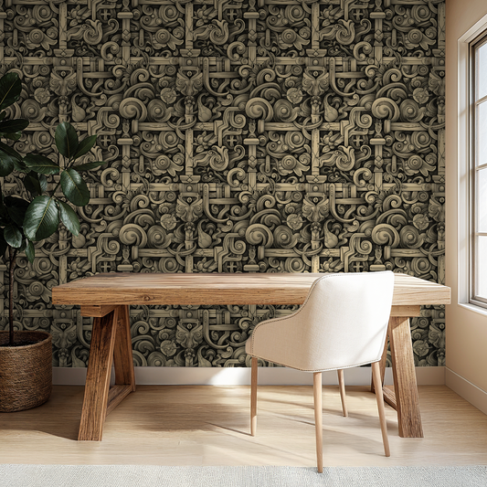
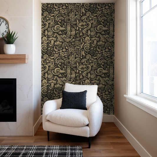
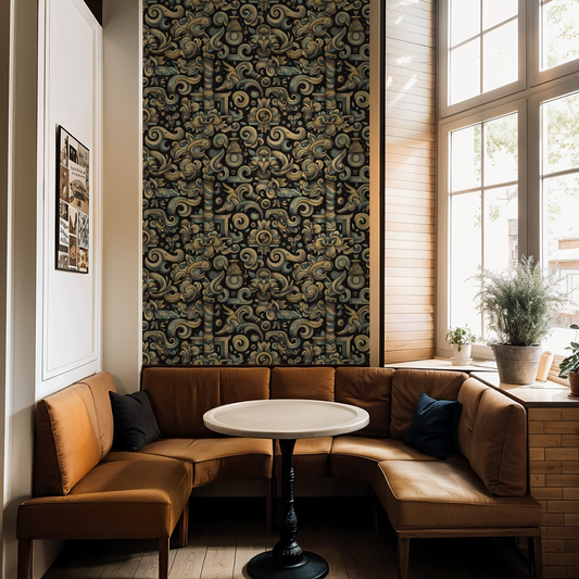
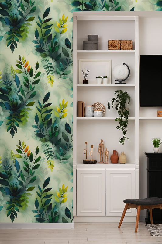
Works beautifully in: Dining rooms that can handle structured color commitment, bedrooms where you want presence without pattern chaos, hallways with adequate height for vertical impact, or accent walls in living spaces that need architectural definition through color. This is for people who want bold stripes with botanical sophistication.
Real talk: Panel Burn combines two strong design moves—vertical stripes and florals—which means it commands serious wall real estate. The wide vertical bands will emphasize ceiling height (ideal for 8-9 foot rooms, potentially overwhelming under 7 feet). The orange sections are genuinely saturated—this is not muted terracotta or dusty coral, but actual vibrant orange. The green sections provide necessary balance, but the orange will be the dominant visual presence. The botanical elements within each stripe add organic softness that prevents this from reading as pure geometric color blocking. Unlike Flash Frame's alternating structure, Panel Burn uses wider, less frequent color transitions, creating a more relaxed rhythm. The painterly quality in the orange panels—visible brushwork, gradients, texture—keeps this from feeling too rigid or corporate. If you want maximum floral density, look at Edge of Eden. If you want pure color blocking without botanicals, this isn't it. Panel Burn sits in the sweet spot: structured color with organic grace notes.
For color maximalists with spatial awareness, stripe enthusiasts who still want florals, and anyone who believes vertical divisions can coexist with botanical abundance.
Collection note: Part of the Eventide series, where we capture twilight's refusal to choose between warmth and shadow.
First wall? Our measuring guide takes ten minutes, and the peel-and-stick and paste-the-wall install guides walk you through hanging day.