Where polished surfaces meet beautiful deterioration.
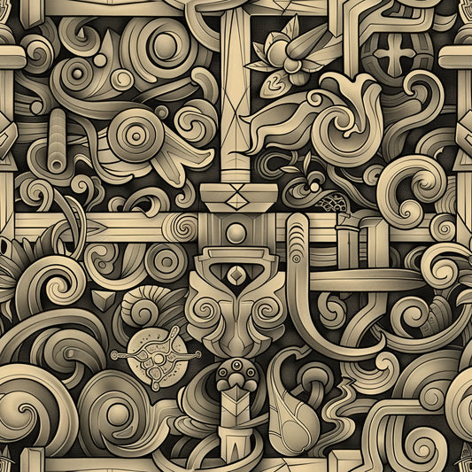
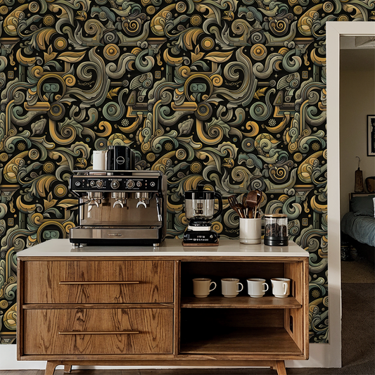
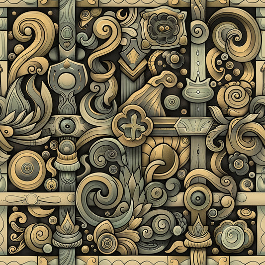
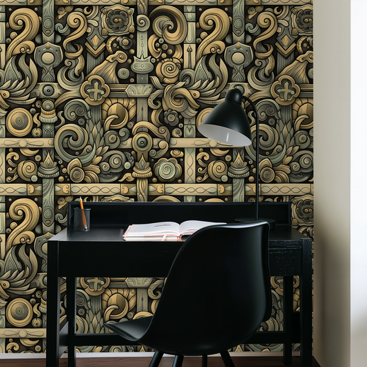
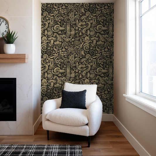
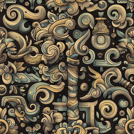
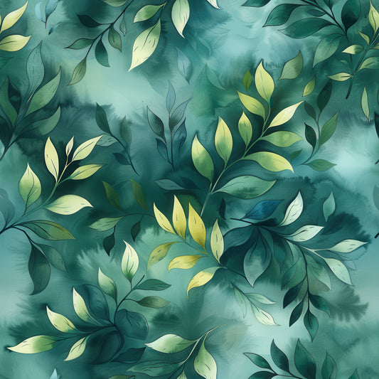
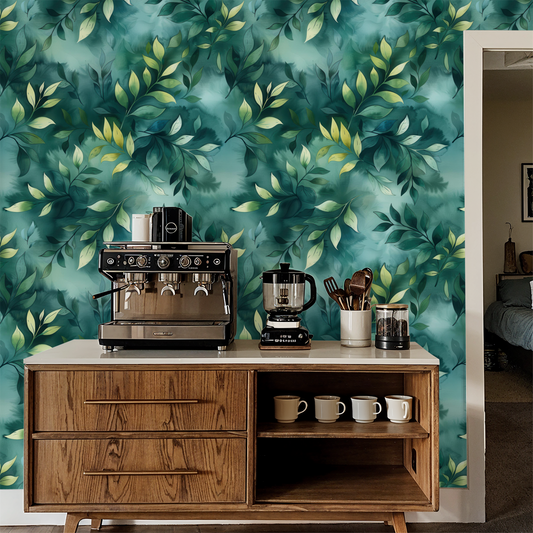
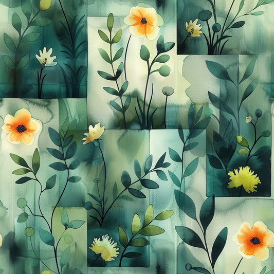
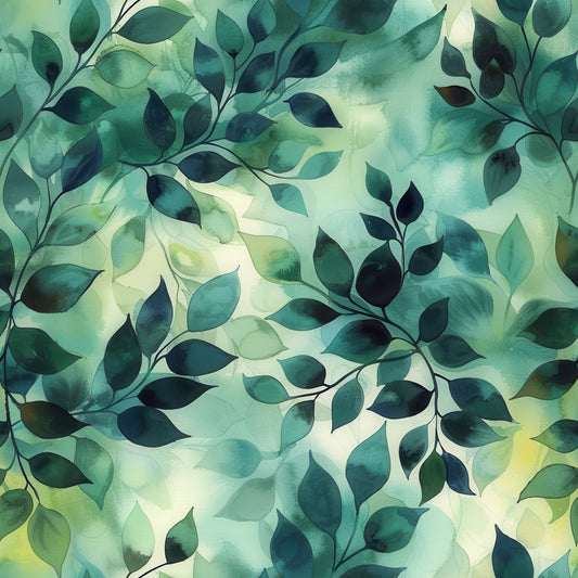
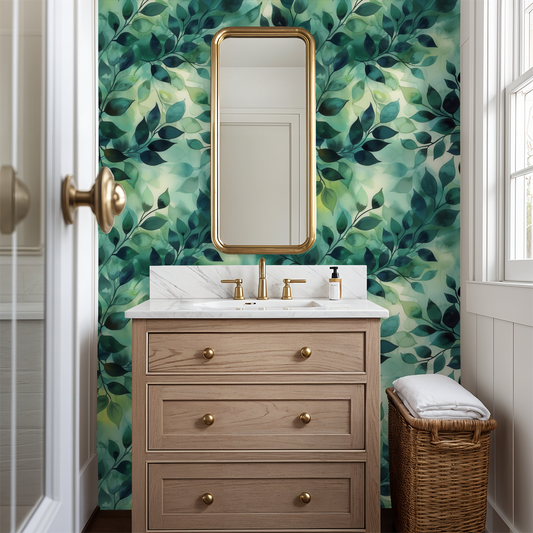
Lacquer gives you the largest expanses of smooth, clean gold in the Velvet Tempest collection—almost lustrous sections that suggest freshly applied gilt or lacquered panels. But then those pristine surfaces butt against heavily weathered crimson and forest green areas with pronounced crackling, creating deliberate tension between preservation and decay. The flowing organic shapes layer with clear definition, each element maintaining distinct boundaries rather than bleeding into atmospheric blend. It's the collection's study in contrasts.
The vibe: Restoration in progress meets intentional neglect. Polished with grit. The kind of pattern that celebrates both craftsmanship and entropy without choosing sides.
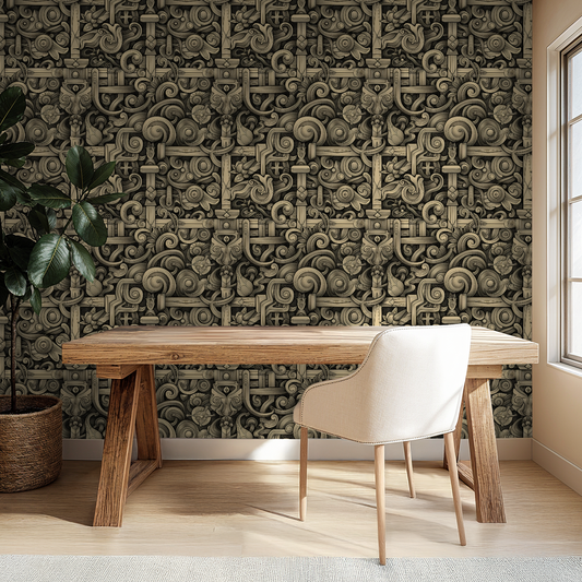
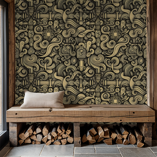
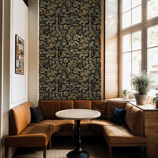
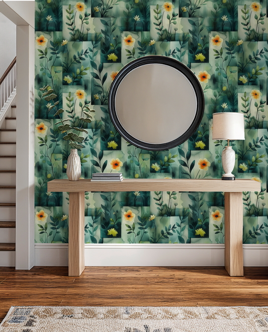
Works beautifully in: High-end retail spaces, boutique hotel reception areas, upscale salon feature walls, architectural firm offices, gallery-style powder rooms, craft cocktail bars with design credentials, creative studios that value precision, or any space where "refined but not precious" is the brief. This is for people who appreciate both meticulous craft and organic imperfection.
Real talk: Lacquer stands out in Velvet Tempest for having the most visual contrast between smooth and textured areas—those clean gold sections feel almost contemporary against the distressed portions, which creates interesting tension. This makes it simultaneously the most accessible and most conceptually complex design in the collection. The larger gold areas reflect more light than Gilt or Surge, which can brighten a space, but the sharp transitions between polished and weathered might feel too deliberate if you want seamless atmospheric blending. If you prefer Reverie's soft transitions or Crimson's committed intensity, Lacquer's push-pull between refinement and decay might feel indecisive. But if you're drawn to that specific tension—the idea that beauty exists in the contrast between pristine and distressed—Lacquer articulates that philosophy clearly.
The smooth gold sections create dramatic light reflection that shifts throughout the day, while the crackled areas absorb light and create depth—meaning the pattern's apparent contrast intensifies in direct lighting and softens in ambient conditions.
For people who appreciate contradiction, design professionals who think binaries are boring, craft enthusiasts who understand both perfection and patina, and anyone who believes the best beauty contains opposing forces.
Available in 19" wide rolls across three material tiers—because contrasting elements deserve cohesive foundation.
Collection note: Part of the Velvet Tempest series, where we celebrate layered luxury, the beauty of weathered surfaces, and the drama of jewel tones in motion.
First wall? Our measuring guide takes ten minutes, and the peel-and-stick and paste-the-wall install guides walk you through hanging day.