Red takes over and refuses to apologize.
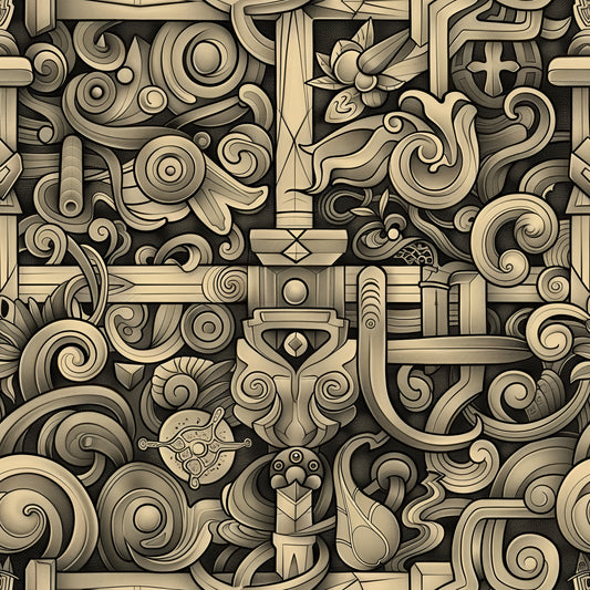
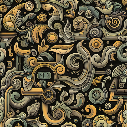
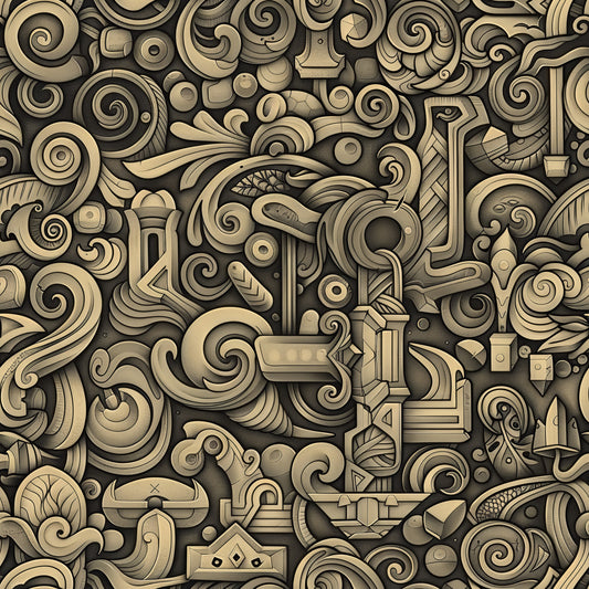
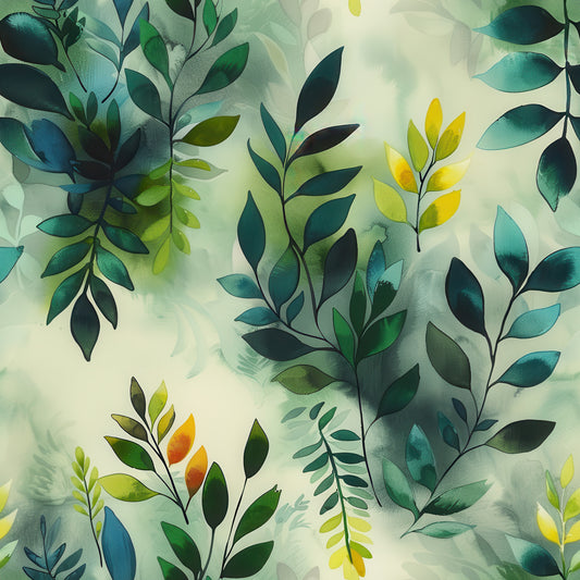
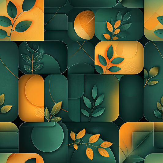
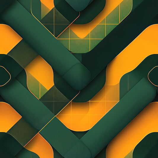
Crimson doubles down on the burgundy and deep red tones that accent the other Velvet Tempest designs—here they dominate with unapologetic intensity. Forest greens and antique gold still appear, but they serve the red rather than balancing it. The weathered, crackled surfaces reach maximum texture complexity in this version, with pronounced distressing that suggests centuries of oxidation, heat exposure, or beautiful neglect. Each overlapping shape creates shadows that deepen the already-saturated crimson into near-black in places, then catches light to reveal bright scarlet highlights.
The vibe: Maximalist theater meets oxidized passion. Intense with purpose. The kind of pattern that makes people either immediately commit or immediately back away—there's no polite middle ground.
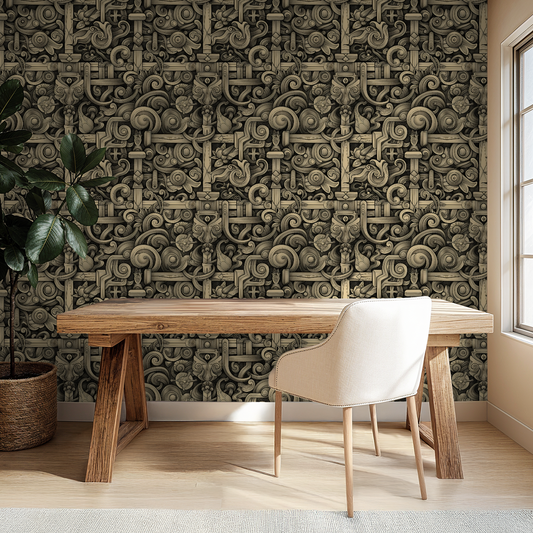
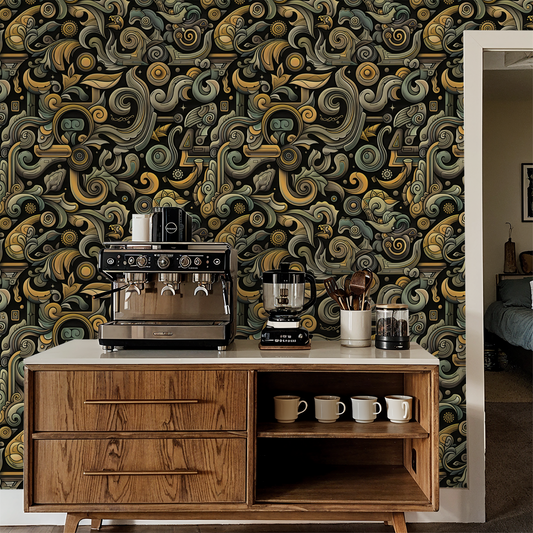
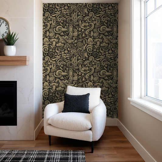
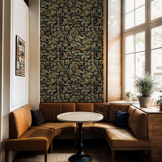
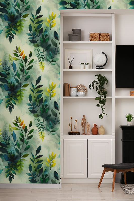
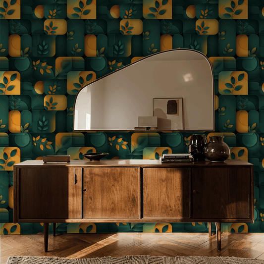
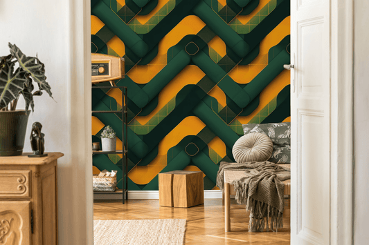
Works beautifully in: Bold dining rooms, upscale steakhouse feature walls, theatrical performance spaces, speakeasy bars that mean it, boutique hotel statement suites, recording studios with rock credentials, gallery walls for dramatic art, or any commercial space where "memorable" matters more than "safe." This is for people who specifically want red walls but refuse to settle for flat paint.
Real talk: This is the most visually intense pattern in Velvet Tempest and arguably one of the boldest designs across all Fringe Wall Co collections. The red saturation creates genuine emotional impact—this pattern has presence that affects room atmosphere in measurable ways. If you're hesitant about committing to red walls, Crimson will not ease you into that decision gently. The heavy crackling texture on predominantly red surfaces creates maximum visual complexity, meaning every square foot offers detail to examine. This is not a neutral, not a backdrop, not something that plays nice with competing focal points. But if you want wallpaper that transforms a room into an experience and you're specifically drawn to deep reds, Crimson delivers that transformation without compromise. The color intensity means artificial lighting choices matter significantly here.
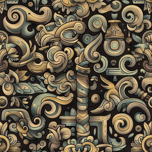
The red dominance creates warm, enveloping atmosphere in evening light, while natural daylight reveals the green undertones and prevents the red from feeling flat or one-dimensional.
For people who commit fully, bold restaurant designers, red wine enthusiasts with matching aesthetic preferences, and anyone who thinks "too much red" is a challenge, not a warning.
Available in 19" wide rolls across three material tiers—because this level of intensity deserves proper construction.
Collection note: Part of the Velvet Tempest series, where we celebrate layered luxury, the beauty of weathered surfaces, and the drama of jewel tones in motion.
First wall? Our measuring guide takes ten minutes, and the peel-and-stick and paste-the-wall install guides walk you through hanging day.